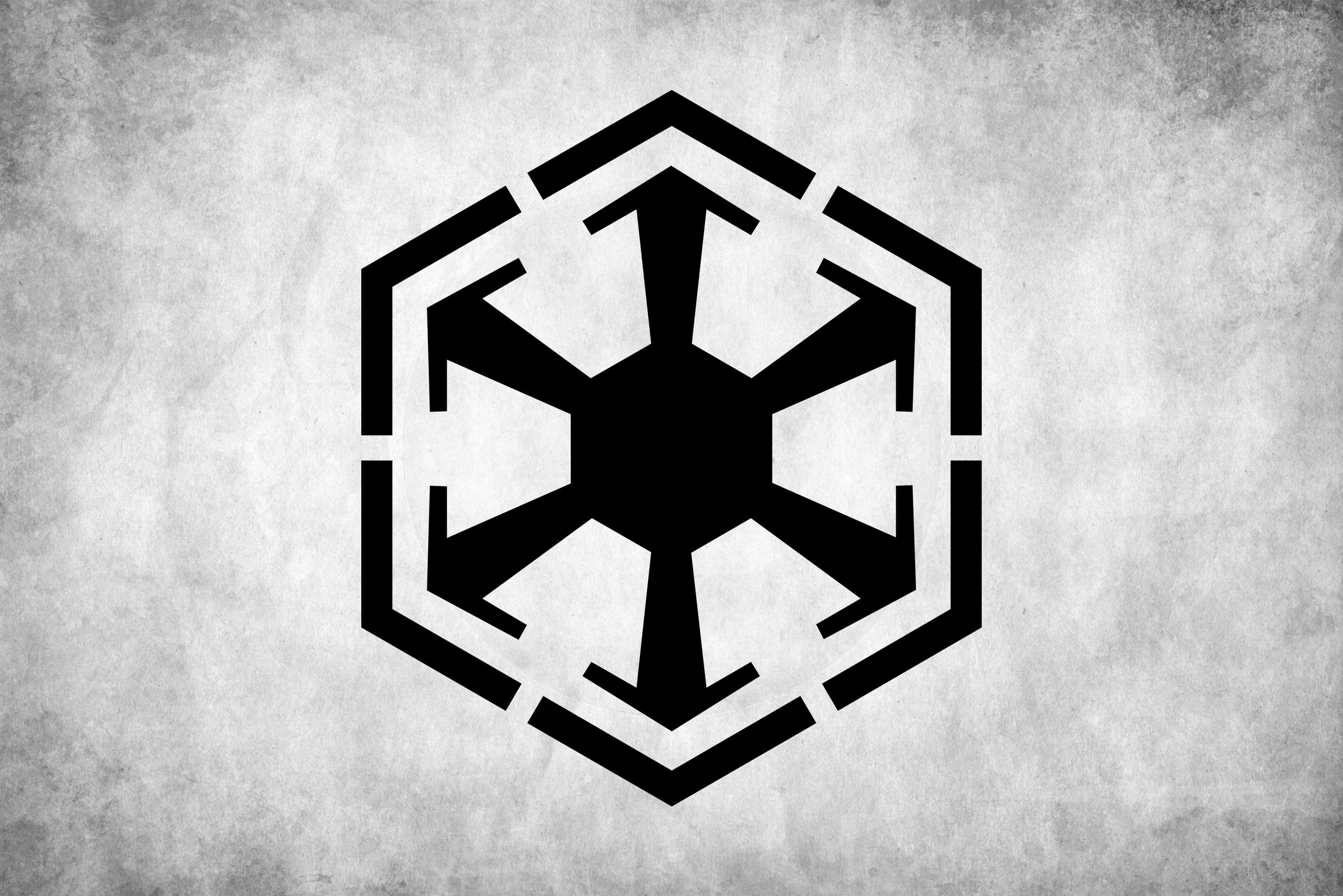
It is everywhere. You see it on t-shirts, tattooed on forearms, and plastered across gaming consoles. But honestly, most fans get the Star Wars Sith logo mixed up with the Galactic Empire’s cog or the Old Republic’s gear. It’s confusing. Lucasfilm has spent decades layering lore upon lore, often retroactively changing what these symbols actually represent. If you’ve ever looked at a red sticker and thought "Sith," you might only be half right.
The truth is, there isn't just one single logo. There are several.
Depending on which era of the timeline you’re looking at—whether it’s the high-octane days of the Old Republic or the era of Darth Vader—the "official" mark of the dark side shifts. It’s a branding nightmare. But for the Sith, these symbols weren't just about looking cool for the sake of merchandising. They were declarations of religious intent and political dominance.
The Six-Pointed Star: Where the Star Wars Sith Logo Actually Starts
The most recognizable Star Wars Sith logo is the six-pointed star, often referred to as the "Sith Hex" or the "Sith Eternal" crest. This isn't the Imperial Cog. Look closer. While the Empire used a six-spoked gear, the ancient Sith crest is more floral, more pointed, and looks significantly more "ancient occult" than "industrial military."
This specific design gained massive traction with The Rise of Skywalker. We saw it on Exegol. It was carved into the stone of the Sith throne. It’s the mark of a cult. Specifically, the Sith Eternal—those creepy hooded fanatics who spent decades trying to bring Palpatine back to life—used this as their primary identifier.
Why six points?
In the real world, concept artists at Lucasfilm, like Doug Chiang, often look for shapes that feel aggressive. Sharp angles. Symmetrical but harsh. In the lore, some suggest the points represent the way the Dark Side radiates outward from a single, selfish point of power. Unlike the Jedi symbol, which features wings and a central light, the Sith marks are almost always enclosed or spiked. They feel trapped. They feel like a weapon.
That Weird Sunburst: The Era of the Old Republic
If you grew up playing Knights of the Old Republic or the SWTOR MMO, you know the "Sunburst" logo. This is a totally different beast. It looks like a jagged sun with a hole in the middle. It’s aggressive. It’s loud. It’s the logo of a Sith Empire that wasn't hiding in the shadows.
Back then, Sith were an army. They had thousands of members. They had a navy.
They needed a flag.
This version of the Star Wars Sith logo was meant to contrast directly with the Galactic Republic’s circular emblem. It’s a "shattered" version of order. If the Republic’s logo represents a unified galaxy, the Sith Sunburst represents a galaxy broken and remade in their image. Interestingly, this logo is one of the few that actually looks like it belongs on a uniform. It’s clean. It’s recognizable from a distance. It’s the kind of thing a Sith Trooper would have painted on their chest plate before getting cut down by a Jedi Knight.
The Confusion Between the Empire and the Sith
Here is where people get tripped up.
The Galactic Empire’s logo—the classic six-spoked gear—is NOT technically a Sith logo. It is a state symbol. Now, obviously, the guy running the state was a Sith Lord. Palpatine (Darth Sidious) was all about branding. But he was also a master of hiding in plain sight. Using a religious Sith icon as the national flag of the Empire would have been a bit of a "spoiler alert" for the billions of citizens who didn't know their Emperor was a space wizard.
However, the Imperial Cog is an evolution.
If you look at the "Bendu" symbol from the Clone Wars era, which represented a balance of the Force, you can see how Palpatine twisted it. He took a symbol of harmony and turned it into a gear of war. It’s a classic dictator move. Take something the people already trust, sharpen the edges, and make it yours. So, while you might see a toy labeled with a Star Wars Sith logo that looks like the Imperial Cog, just know that a "true" Sith would likely prefer the ancient, spiked versions found in the tombs of Korriban.
The Sith Eternal and the Modern Redefinition
When Episode IX hit theaters, we got a fresh look at Sith iconography. The Sith Eternal crest is arguably the "truest" version of the logo we have in the current canon. It appears on the wayfinders. It’s the key to finding the hidden world of the Sith.
Think of it this way:
- The Imperial Cog: The face the Sith showed the public.
- The Sunburst: The face the Sith showed their enemies during open war.
- The Sith Eternal Hex: The secret mark of the religion itself.
The Hex is fascinating because it’s so geometric. It lacks the "organic" feel of the Jedi Order’s wings and flame. This is intentional. The Dark Side is often associated with the unnatural—the bending of reality to one’s will. A perfectly symmetrical, sharp-edged hex feels manufactured. It feels like someone forced the Force into a box.
Why the Colors Actually Matter
You can't talk about the Star Wars Sith logo without talking about red. Why is it always red?
It’s not just because "red equals evil" in movie tropes. In the Star Wars universe, Sith lightsabers are red because they "bleed" the kyber crystals. They take a living, sentient crystal and pour their rage and pain into it until it submits. The color of their logo reflects this. It’s the color of subjugation.
Whenever you see these logos in games or movies, they are almost always presented in high-contrast red, black, or deep grey. It’s psychological warfare. The Jedi use soft blues, greens, and whites. The Sith use the colors of a dying star or a fresh wound. It’s branding 101 for galactic tyrants.
Real-World Influence: Where Did These Shapes Come From?
The designers at Lucasfilm aren't just doodling. They pull from history. The various iterations of the Star Wars Sith logo draw from diverse sources:
- Imperialism: The sharp, mechanical lines of the Imperial Cog are heavily influenced by 20th-century authoritarian aesthetics. It’s meant to feel cold.
- Alchemy: The more ancient Sith marks often resemble alchemical symbols or sigils used in historical occultism.
- Nature (Twisted): Some versions of the Sith crest look like a predatory Maw or a carnivorous plant. It’s nature, but the scary part of nature.
What Most People Miss About the "Sith" Name
Funny enough, the word "Sith" wasn't even mentioned in the original 1977 movie. It was in the script and the novelization, but not the film. Fans just knew Vader was a "Dark Lord." It wasn't until the Prequels that the branding really took off.
This is why the logos vary so much. The "Sith" as a concept evolved over forty years of filmmaking. In the 70s, they were just "the bad guys." By the 2020s, they are a multi-generational shadow organization with a deep, religious history and a very specific graphic design manual.
How to Use the Sith Logo Properly Today
If you’re a creator, a cosplayer, or just someone looking to buy a decal for your car, you need to know which "vibe" you’re going for.
If you want to represent the military might of Vader and Tarkin, you go with the Imperial Cog. It’s the classic choice. It says "I like order, even if it’s a bit fascist."
If you are a deep-lore nerd who loves the history of Revan and Malak, you go with the Old Republic Sith Sunburst. It’s a deep cut. It shows you know your stuff beyond the movies.
If you’re into the occult, "hidden master" side of the Dark Side—the stuff involving clones, hidden planets, and ancient rituals—the Sith Eternal Hex is your go-to. It’s the most modern version of the Star Wars Sith logo and arguably the most "evil" looking one.
A Legacy of Power
Ultimately, these symbols work because they represent an idea. The Jedi represent the self-sacrificing protector. The Sith represent the self-actualized god. Their logos are designed to be intimidating because the Sith want you to be afraid. Fear is their fuel.
Whether it's the six points of the hex or the jagged rays of the sunburst, the message is always the same: The individual is everything, and the galaxy belongs to those strong enough to take it. Next time you see one of these marks, look at the points. Count the spokes. You’ll realize that "Star Wars Sith logo" isn't just one thing—it’s a visual history of a cult that refused to stay dead, shifting its shape every time it crawled back out of the shadows.
Actionable Steps for Sith Iconography Enthusiasts
- Identify the Era: Before buying merchandise or using a logo in a project, check if it belongs to the Old Republic, the Galactic Empire, or the Sith Eternal. Mixing them up is a major "faux pas" in the fan community.
- Check the Spokes: A true Imperial Cog has six spokes. Some knock-off designs mistakenly use eight or five. If you want accuracy, six is the magic number for the Empire.
- Contrast is Key: If you are designing something around a Star Wars Sith logo, stick to the "Sith Palette." Deep crimson (#8B0000), pitch black (#000000), and a cold, metallic grey.
- Understand the Lore: If you’re getting a tattoo, look into the Sith Code. It adds a layer of depth to the symbol. The logo represents the first line of the code: "Peace is a lie, there is only passion."
- Source High-Res Vectors: For any graphic design work, always look for "SVG" files of the Sith Eternal or Imperial emblems. Because these logos are geometric, any pixelation ruins the "sharp" and "intimidating" look they are supposed to have.