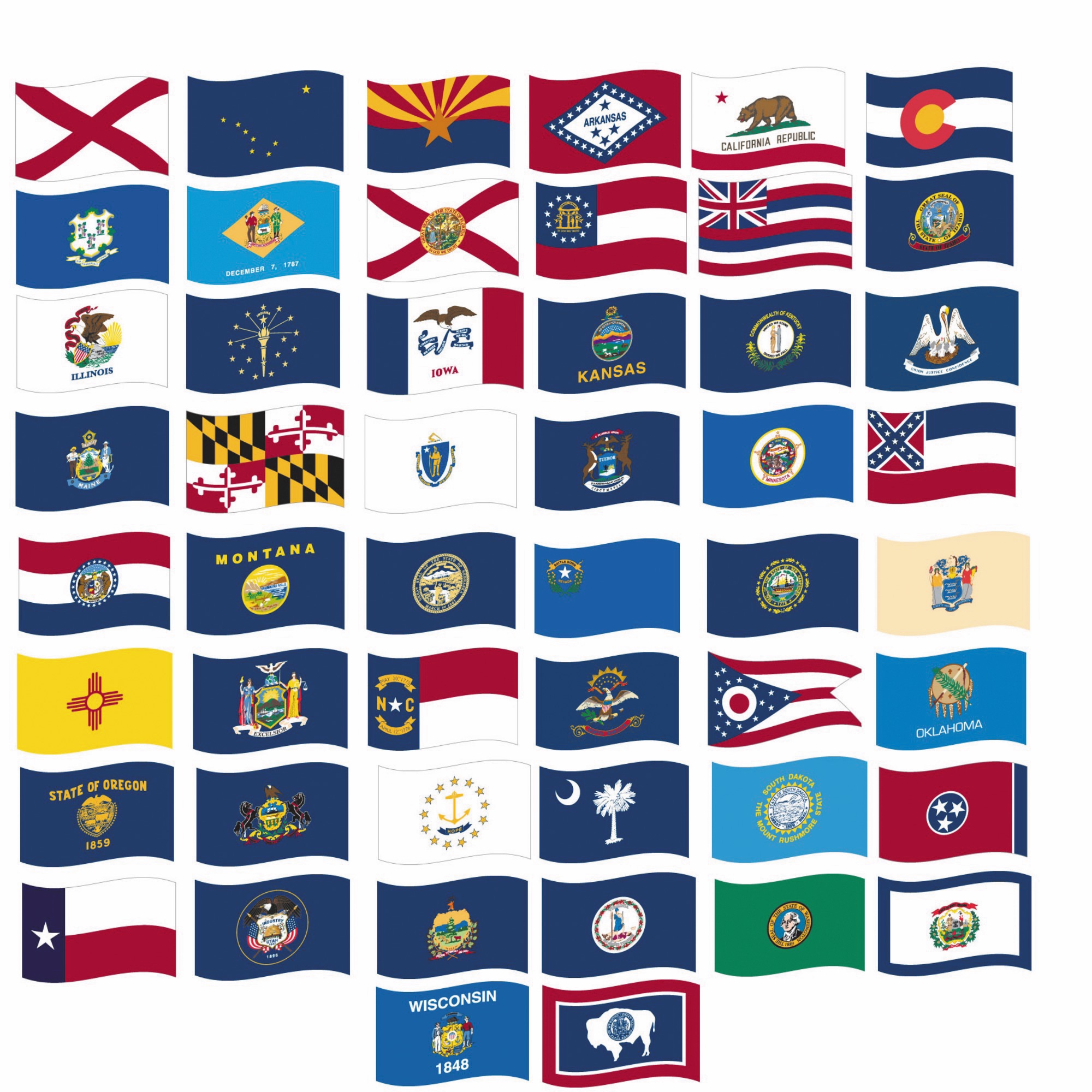
Walk into any state capitol building and you’ll see it. A blue sheet. A gold circle. Some tiny, unreadable Latin text. It’s the "Seal on a Bedsheet" problem, and if you’ve ever tried to tell the difference between the flags of Nebraska, Pennsylvania, and New Hampshire from a distance, you know the struggle is real. Flags of states of USA should be iconic, but most are just legal documents printed on fabric.
Design is hard.
For decades, vexillologists—people who study flags—have been screaming into the void about how bad most American state flags are. Ted Kaye, a massive name in the North American Vexillological Association (NAVA), literally wrote the book on this. It's called Good Flag, Bad Flag. He argues that a child should be able to draw a flag from memory. If you need a magnifying glass to see a cow or a tiny boat in the center of a blue field, the flag has failed its one job.
The Great Flag Revolution of the 2020s
We are actually living through a weirdly historic moment for flags of states of USA. Since 2020, there’s been this massive wave of states looking in the mirror and realizing their branding is a mess.
Mississippi led the charge. They dropped the Confederate battle emblem and replaced it with a magnolia. It was a huge shift. Then Utah jumped in. They ditched their cluttered seal for a bold, tri-color mountain design with a beehive. It looks like a high-end outdoor brand logo, and people actually want to wear it on hats now.
Minnesota just did the same thing in early 2024. Their old flag was—honestly—a disaster. It featured a pioneer tilling soil while a Native American rode off into the sunset. It was cluttered, controversial, and visually busy. The new one is a simple blue shape representing the state's silhouette and a North Star. It’s clean. It’s modern. Some people hate it because it feels "too corporate," but you can actually recognize it from a mile away.
Why the "Seal on a Bedsheet" Happened
You might wonder why so many states settled for such boring designs in the first place. History plays a part. Back in the late 19th and early 20th centuries, states wanted to show off their authority. They just slapped their official state seal on a blue background because blue was the color of the Union.
It was lazy. It was also cheap.
But a seal is meant for a piece of paper on a desk, not a piece of nylon flapping 50 feet in the air. When the wind isn't blowing, a seal-based flag just looks like a blue rag. Look at the flag of Maine. It has a farmer and a sailor. It’s got a pine tree. It’s got a moose. It’s got a star. It’s got a motto. It’s basically a scrapbook. There is actually a huge movement in Maine right now to go back to their 1901 flag—a simple green pine tree and a blue North Star on a buff background. It’s vintage, it’s cool, and it doesn't look like every other state's homework.
The Holy Trinity of American State Flags
There are three flags that everyone agrees are perfect. If you live in one of these states, you probably see the flag on everything from beer cans to tattoos.
- New Mexico: This is the GOAT. A red Zia sun symbol on a field of yellow. It’s simple. It honors the Indigenous heritage of the land without being exploitative. It uses only two colors. It’s perfection.
- Texas: The Lone Star. It’s bold. It’s recognizable. It screams "Texas" before you even see the person holding it.
- Maryland: Okay, this one is polarizing. It’s loud. It’s messy. It uses the heraldic banners of the Calvert and Crossland families. It looks like a medieval knight’s pajamas. But here’s the thing—it’s memorable. Marylanders are obsessed with it. They put it on their socks, their helmets, and their crab seasoning.
If a flag doesn't make people want to buy a sticker of it for their laptop, is it even a good flag?
Why Vexillology Matters More Than You Think
Flags are basically the ultimate form of "lifestyle" branding for a government. When a flag is good, it creates a sense of place. Think about Chicago’s city flag. People in Chicago love that flag. They trust it.
But when we talk about the flags of states of USA, we’re often talking about identity crises. Many states are stuck between "honoring tradition" and "not being boring." Illinois is currently looking at a redesign. Michigan has had bills introduced to change theirs. The momentum is real because states are realizing that a good flag is basically free marketing.
The Five Basic Rules of Flag Design
According to the experts at NAVA, there are five rules that make or break a flag.
- Keep it simple. So simple a child can draw it from memory.
- Use meaningful symbolism. The colors and images should relate to the state.
- Use 2 or 3 basic colors. Don't go overboard with the palette.
- No lettering or seals. If you have to write the name of your state on the flag, your symbolism failed.
- Be distinctive. Don't just copy the guy next to you.
Washington state is an interesting outlier. It’s the only green state flag. It has George Washington’s face on it. Technically, it breaks the "no faces/no seals" rule, but because it’s the only green one, it’s actually somewhat recognizable. It’s the "ugly-cool" of the flag world.
The Politics of Fabric
Changing a flag is never just about aesthetics. It’s always a fight. When Georgia changed its flag in the early 2000s to remove the Confederate battle cross, it was a massive political firestorm. When Mississippi changed theirs in 2020, it required a huge push from athletes, religious leaders, and business owners who realized the old flag was hurting the state's economy.
People get attached to what they know. Even if what they know is a cluttered blue mess. There’s a certain "so bad it's good" nostalgia that keeps these designs alive. But as more states like Utah and Minnesota prove that a redesign can actually be popular, the pressure on states like Wisconsin or West Virginia to modernize is only going to grow.
Honestly, the era of the "Seal on a Bedsheet" is dying.
Actionable Insights for Flag Enthusiasts
If you’re interested in the flags of states of USA and want to dive deeper or even advocate for a change in your own state, here is how you actually get involved.
Audit your own state flag. Look at it through the lens of the five rules mentioned above. Does it have text? Is it just a seal? If you saw it on a pole across a football field, would you know it’s your state, or could it be Kansas?
Follow the legislative trail. Most flag changes start with a small group of citizens or a single legislator. Check if there are active petitions in your state. For example, groups in Massachusetts and Maine have been very active lately.
Support local vexillology. Join the North American Vexillological Association (NAVA). They provide the research and the historical context that lawmakers use when they decide to finally fix a bad design.
Buy the "good" version. If your state has a historic or alternative flag that looks better than the current one (like the 1901 Maine flag or the "Appeal to Heaven" flag in some contexts), start flying it. Public sentiment often shifts when people see how much better a simple design looks in the real world.
The evolution of American state flags isn't just about art; it's about how we choose to represent ourselves to the world. We’re moving toward a future where flags are actually designed to be seen, not just filed away in a cabinet.