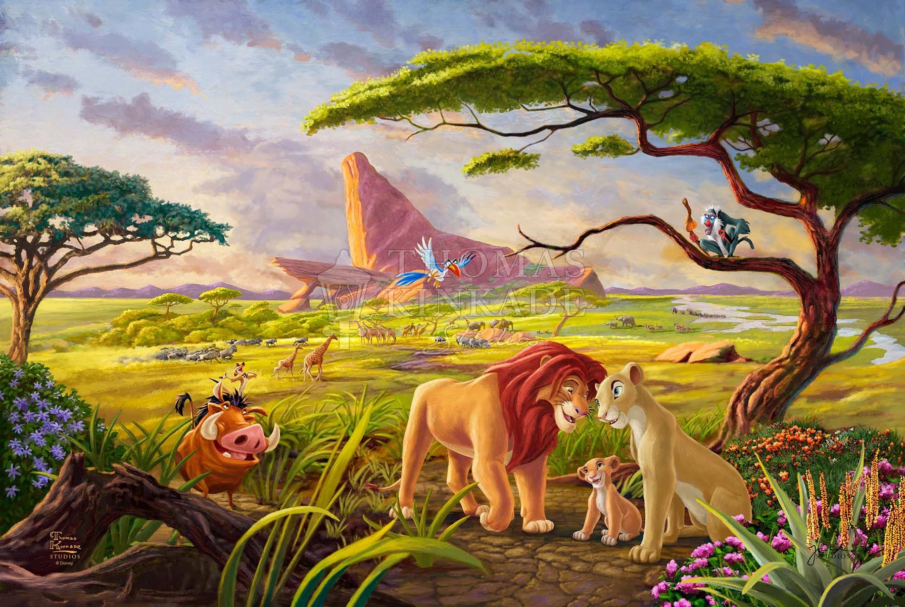
Walk into any child's bedroom from 1994, or honestly, any millennial's living room today, and you’ll find them. Images from The Lion King are basically the wallpaper of a generation’s collective memory. It isn't just nostalgia talking. There is something fundamentally "prestige" about the visual language of this movie that Disney hasn't quite replicated since, even with all the 4K rendering power in the world.
When we talk about these visuals, we aren't just talking about a cartoon. We’re talking about a massive shift in how Western animation handled light, scale, and emotional weight.
The Pride Lands Weren't Just Painted—They Were Engineered
Most people think Disney artists just sat down and drew some lions. It was way more intense than that. In 1991, a small crew of animators traveled to Hell’s Gate National Park in Kenya. They weren't just taking vacation photos; they were studying the way the African sun flattens the horizon at noon and turns everything to deep violet at dusk.
This research trip changed everything.
If you look closely at the backgrounds painted by artists like Hans Bacher, you’ll notice they used a specific "long lens" look. It’s a trick from live-action filmmaking. By blurring the foreground and the extreme background, they forced your eyes to stay locked on Simba or Mufasa. It made the movie feel cinematic. It felt like a nature documentary, but with more Shakespearean drama and better catchy tunes.
Why the 2019 "Live Action" Stills Felt... Off
We have to talk about the elephant in the room. Or the CGI lion in the room.
When the 2019 "photorealistic" version dropped, the internet was flooded with side-by-side comparisons of images from The Lion King 1994 vs. 2019. The tech was objectively incredible. Jon Favreau’s team used VR sets to "film" inside a digital savanna. Every hair on Simba’s mane had its own physics.
But it felt cold. Why?
Expression. In the original hand-drawn frames, the animators cheated reality to show us what the characters were feeling. They widened the eyes. They moved the "brows" (which lions don't really have) to show grief. When Mufasa dies in the 1994 version, his face is a mask of pure terror and betrayal. In the 2019 version, he looks like... well, a lion. And lions don't show emotion the way humans do.
The 1994 visuals are iconic because they are "hyper-real" in spirit, even if they aren't "photo-real" in execution.
The Stampede: 2.5 Minutes That Took Years
Let’s get into the weeds of the wildebeest stampede. This is arguably the most famous sequence in animation history. At the time, CGI was in its infancy. Pixar hadn’t even released Toy Story yet.
The tech team at Disney had to write an entirely new program called "CGI7" just to handle the wildebeests. They didn't just animate 800 animals. They animated a few, gave them "brains" so they wouldn't run into each other, and then multiplied them.
The result?
A terrifying, dusty, claustrophobic mess of brown and grey. It's a masterclass in using color—or the lack of it—to signal danger. Most of the movie is vibrant greens and golds, but the gorge is drained of life. That visual contrast is why that scene still makes grown adults cry.
Those Iconic Silhouettes on the Log
You know the one. Simba, Timon, and Pumbaa walking across a fallen log in front of a massive moon.
It’s the "Hakuna Matata" transition.
This specific image is used in almost all Disney marketing because it perfectly illustrates the passage of time without a single word of dialogue. We see Simba grow from a cub to a teenager to a full-grown King in the span of a few seconds, all against that glowing white circle. It’s simple. It’s clean. It’s high-contrast.
In terms of composition, it’s a direct nod to classic stage theater. The characters are "backlit," turning them into graphic shapes. Even if you didn't know their names, you’d recognize those shapes anywhere.
The Colors of Evil
Have you ever noticed that Scar’s lair looks nothing like the rest of the Pride Lands?
While the rest of the world uses warm earth tones, Scar is associated with acidic greens and harsh shadows. The "Be Prepared" sequence is basically a 1930s German Expressionist film disguised as a kids' movie. The animators used low-angle "uplighting" on Scar to make him look ghoulish. It’s the same trick you use when you put a flashlight under your chin to tell a ghost story.
This use of color theory is why kids understood Scar was the villain before he even did anything bad. The visuals told the story.
Finding the Best High-Res Images From The Lion King Today
If you are looking for high-quality images from The Lion King for a project or just a sick desktop background, don't just grab a random screenshot from a YouTube rip.
The 2011 Diamond Edition and the subsequent 4K Ultra HD releases changed the color grading significantly. Some purists argue that the 4K version is "too clean" and loses some of the original cel-animation grit. However, for sheer detail, the 4K transfers are unbeatable. You can actually see the texture of the paint on the background layers.
Where to Look for Authentic Art:
- The Walt Disney Archives: They occasionally release high-res scans of original "concept paintings" by artists like Chris Sanders (who later did Lilo & Stitch).
- Production Cels: If you want the real deal, look at auction sites like Heritage Auctions. You’ll see the actual acetate sheets used in the film. These give you the clearest look at the line work.
- Art Books: "The Art of The Lion King" (the original 1994 release) is the holy grail. It contains sketches that never made it to the screen but show the "vibe" the creators were going for.
Why We Can't Stop Looking
We live in an era of "disposable" visuals. We scroll past a million AI-generated images every day. But the hand-crafted frames of the 1990s Disney Renaissance have staying power because every single line was a choice made by a human being.
When you see Simba looking up at the stars (the "Kings of the Past" scene), you’re seeing the work of hundreds of artists who were obsessed with getting the glow of the nebulae just right. That human effort translates into an emotional resonance that purely digital assets often lack.
It’s about the soul in the machine. Or, in this case, the soul in the ink.
Actionable Ways to Use These Visuals
- For Artists: Study the "color scripts" of the film. Notice how the palette shifts from yellow (safety) to blue (isolation) to red (confrontation).
- For Collectors: Focus on "Layout Drawings" rather than finished cels if you’re on a budget. They show the skeletal structure of the scenes and are often more dynamic.
- For Fans: If you're setting up a home theater, use the "Circle of Life" opening to calibrate your contrast levels. If the sun doesn't look like a burning orange orb without washing out the horizon, your settings are wrong.
The legacy of these visuals isn't just that they look "cool." It's that they taught a generation how to see the world through a lens of myth and majesty. Whether it’s a grainy VHS still or a crisp 4K frame, the power of those African vistas remains untouched.