Walk through any downtown area and look up. You’ll see them. Flags. Most of the time, they are a complete mess. I’m talking about "SOB" flags—Seal on a Bedsheet. It’s a white or blue background with a tiny, intricate circular seal that nobody can read from ten feet away, let alone from the top of a flagpole.
This is exactly why good flag bad flag design principles became a thing in the first place.
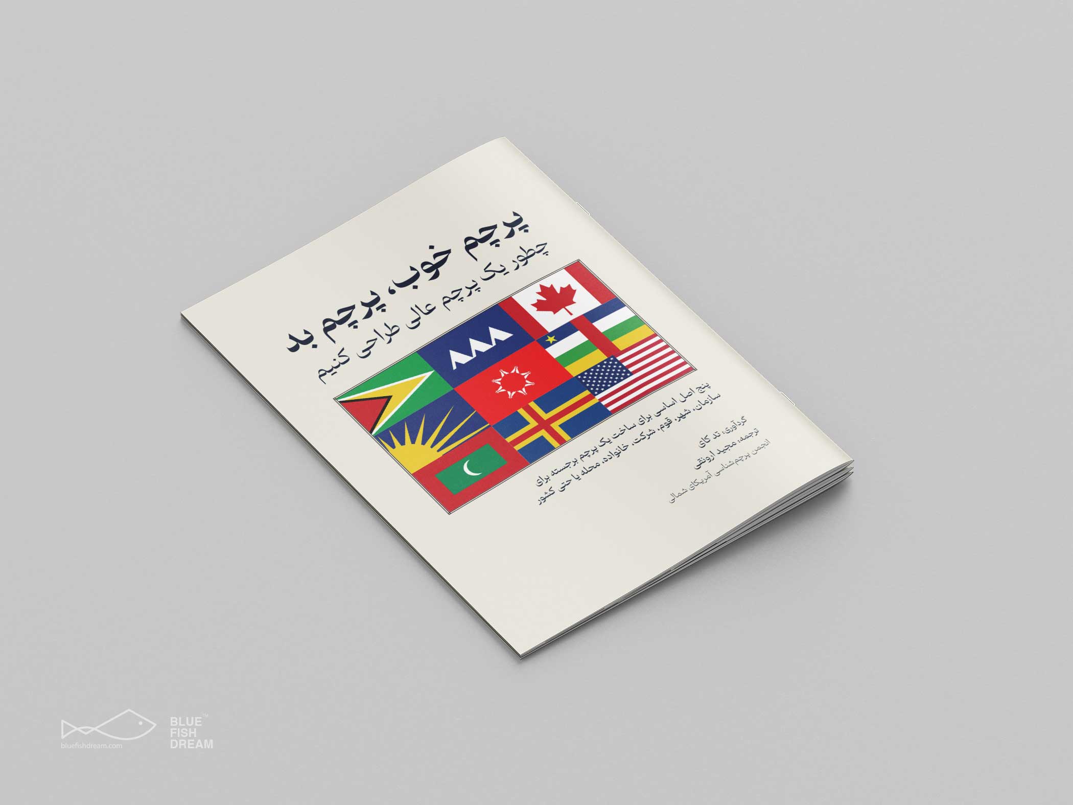
Ted Kaye, a scholar with the North American Vexillological Association (NAVA), literally wrote the book on this. Well, it’s a pamphlet, actually. It's titled Good Flag, Bad Flag, and it’s basically the "Ten Commandments" for people who care about vexillology—the study of flags. If you've ever watched Roman Mars’ viral TED Talk about city flags, you know how passionate people get about this. It’s not just about aesthetics; it’s about identity.
Most people don't realize that a flag is a tool. It’s a piece of technology designed to communicate a message from a distance, often in high wind and varying light. When you fail at the design, you fail at the communication.
The Five Basic Rules of Good Flag Bad Flag
Let's be real: rules are meant to be broken. But you have to understand them first. Kaye’s system is deceptively simple.
First, keep it simple. A child should be able to draw it from memory. Think about the flag of Japan. A red circle on a white field. It’s iconic. Now think about the flag of West Virginia. You’ve got a seal, two guys, a rock, some greenery, and a ribbon. No kid is drawing that in 1st grade without a breakdown.
Second, use meaningful symbolism. Colors and images should relate to what they represent. The blue on the Ukrainian flag represents the sky, while the yellow represents the wheat fields. Simple. Direct. Powerful.
Third, use 2 or 3 colors. Most great flags don't need a whole box of Crayolas. Using too many colors makes the design muddy from a distance. You want contrast. If you have a dark blue next to a black, it's just going to look like a dark blob when the wind isn't blowing.
Fourth, no lettering or seals. This is the big one. This is where everyone messes up. If you have to write the name of your city on your flag, your symbol has failed. Flags are meant to be seen from both sides. If you write "OHIO" on a flag, the person on the other side sees "OIHO." It's nonsense.
Lastly, be distinctive. Don't just copy your neighbor.
Why We Keep Making Ugly Flags
Honestly, it’s usually "design by committee."
When a city council decides they need a new flag, they don't hire a vexillographer. They hold a contest. Or worse, they try to include every single department’s input. The police want a star, the parks department wants a tree, the historical society wants a quill, and the mayor wants his name on it.
The result? A cluttered disaster.
Take the old flag of Pocatello, Idaho. It was once voted the worst flag in North America. It had a trademark symbol on it. A trademark symbol. It looked like a stationary header from a 1990s law firm. They eventually fixed it in 2017 because the internet bullied them into it. That's the power of the good flag bad flag movement—it forces people to realize that a bad flag is a missed opportunity for civic pride.
The Chicago Standard
If you want to see good flag bad flag principles working in the real world, look at Chicago.
People in Chicago love their flag. You see it on hats, t-shirts, tattoos, and even trash cans. It’s two blue stripes and four six-pointed red stars on a white background. It follows all the rules. It’s simple. It’s distinctive. It has deep meaning (the stripes represent branches of the river and the lake; the stars represent major historical events).
Because the design is good, the people adopted it. Contrast that with Milwaukee’s official flag. It’s a kitchen-sink design featuring a giant gear, a ship, a church, a factory, and even a tiny picture of another flag. It’s so bad that a group of citizens created "The People’s Flag of Milwaukee" (the sunrise over the lake) because they were tired of being represented by a scrapbook.
Common Misconceptions About Vexillology
Some critics argue that these rules are too restrictive. They say it makes all flags look like corporate logos.
There's some truth to that. If every flag follows the "3 colors, simple shapes" rule, things can start to look a bit sterile. Look at the recent redesign of the Minnesota state flag. Some people love it because it’s clean and follows the good flag bad flag guidelines perfectly. Others hate it because they feel it lost the "soul" or history of the original, even if the original was an objectively bad design according to NAVA.
The nuance here is that a flag doesn't have to be a masterpiece of fine art. It’s a signal.
How to Fix a Bad Flag
If you’re looking at your own city or state flag and realizing it’s a "bad" one, don't panic. Change is possible, but it’s a political minefield.
- Audit the current design. Does it have words? Is it a seal on a blue background? If yes, it’s probably failing the basic utility test.
- Focus on the "why". Why does the community exist? In Portland, Oregon, the flag uses green for forests and a "four-way" intersection of lines to represent the confluence of rivers. It’s abstract but meaningful.
- Ditch the seal. Seals are for documents. They are meant to be read at a desk from 12 inches away. Flags are meant to be seen from 50 feet away while flapping.
- Test the "Thumbnail Test". Shrink the design down to the size of a postage stamp on your computer screen. Can you still tell what it is? If it’s just a colorful smudge, go back to the drawing board.
- Engage the public, but limit the scope. Don't ask people to "draw a flag." Ask them what symbols represent their home. Let professional designers or vexillologists turn those ideas into shapes.
Actionable Steps for Design Enthusiasts
Whether you are a graphic designer or just a concerned citizen, you can apply these principles to more than just flags. Branding, iconography, and even slide presentations benefit from the "less is more" approach.
- Simplify your color palette: Stick to three primary colors that have high contrast.
- Remove text: If your icon needs a label to be understood, the icon isn't doing its job.
- Embrace abstraction: You don't need a literal drawing of a mountain to represent a mountain. A triangle works better.
- Check for symmetry: Symmetrical designs are easier to process and look better when the flag is draped or still.
The most important takeaway is that flags belong to the people, not the government. A flag that people actually want to fly is a flag that has succeeded. If you want to dive deeper into the technical specifications, check out NAVA’s digital archives or look up the work of Whitney Smith, the man who actually coined the term "vexillology." He designed the flag of Guyana, which is a masterclass in using bold colors and geometric shapes to create an unforgettable image.
Stop settling for seals on bedsheets. We deserve better symbols.